> floatica_
floatica
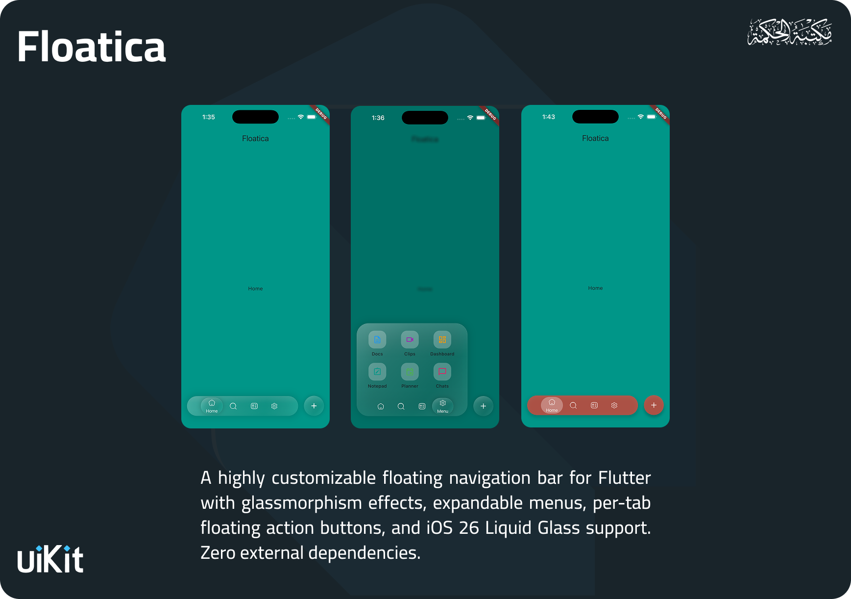
A customizable floating navigation bar for Flutter with glassmorphism, expandable menus, per-tab FABs, and Liquid Glass support.
v1.2.0 MIT #Navigation#Glassmorphism#Overlay#UI#Liquid Glass
5
LIKES
45
DOWNLOADS
94%
HEALTH
150/160
POINTS
> Overview_
Overview
A customizable floating navigation bar for Flutter with glassmorphism, expandable menus, per-tab FABs, and Liquid Glass support.
شريط تنقّل عائم بتأثيرات زجاجية وقوائم قابلة للتوسع.. صُممت لتكون سهلة الاستخدام مع واجهة API بسيطة وواضحة، ومُحسّنة للأداء العالي.
> Platforms_
Platforms
iOSAndroidWebmacOSWindows
> Features_
Features
Floating Navigation Bar — Beautifully animated bottom navigation with smooth tab transitions
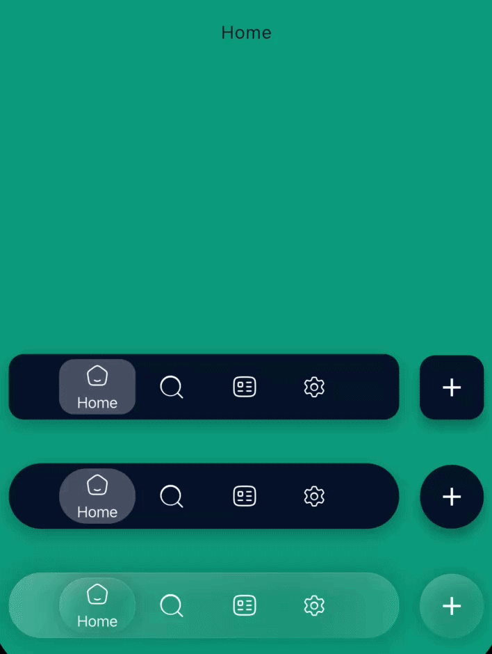
Glassmorphism & Liquid Glass — Built-in glass effects with blur, specular highlights, inner shadows, and frosted noise textures (inspired by iOS 26)
Expandable Menu — Optional overlay menu that animates from the nav bar with barrier blur/dim
Per-Tab Floating Action Button — Each tab can have its own FAB with independent styling and Hero animation support
Multiple Shape Styles — Circle (pill), Rectangle, and Squircle shapes for the nav bar and tabs
Tab Indicators — Background, dot, underline, or no indicator styles
Display Modes — Icon only, title only, or icon + title with label positioning (right or bottom)
Programmatic Menu Control — `FloaticaMenuController` to open, close, or toggle the menu from code
Haptic Feedback — Optional haptic response on tab selection
Badge Support — Attach badge widgets to any tab
Gradient Support — Apply gradients to selected/unselected tab states
Fully Themeable — Colors, text styles, sizes, animations, and more are all customizable
Zero Dependencies — Only depends on Flutter SDK
--
> Installation_
Installation
$ flutter pub add floatica

dependencies:
floatica: ^1.2.0> Quick Start_
Quick Start
import 'package:floatica/floatica.dart';

Scaffold(
  extendBody: true,
  bottomNavigationBar: FloatyNavBar(
    selectedTab: selectedTab,
    tabs: [
      FloaticaTab(
        isSelected: selectedTab == 0,
        onTap: () => changeTab(0),
        title: 'Home',
        icon: const Icon(Icons.home, size: 20),
      ),
      FloaticaTab(
        isSelected: selectedTab == 1,
        onTap: () => changeTab(1),
        title: 'Search',
        icon: const Icon(Icons.search, size: 20),
      ),
      FloaticaTab(
        isSelected: selectedTab == 2,
        onTap: () => changeTab(2),
        title: 'Profile',
        icon: const Icon(Icons.person, size: 20),
      ),
    ],
  ),
);
> Usage_
Usage
// Glass Effects
FloatyNavBar(
  glassEffect: const FloaticaGlassEffect.liquidGlass(),
  ...
);

// Expandable Menu
FloatyNavBar(
  menu: FloaticaMenu(
    icon: const Icon(Icons.apps),
    title: 'Menu',
    child: ...,
  ),
  ...
);

// Floating Action Button
FloaticaTab(
  floatyActionButton: FloaticaActionButton(
    icon: const Icon(Icons.add),
    onTap: () => print('FAB tapped!'),
  ),
  ...
);> Customization_
Customization
// Pill shape (default)
FloatyNavBar(
  shape: const CircleShape(),       // radius: 100
  ...
);

// Rounded rectangle
FloatyNavBar(
  shape: const RectangleShape(),    // radius: 12
  ...
);

// Squircle (continuous corners)
FloatyNavBar(
  shape: const SquircleShape(),     // radius: 24
  ...
);
> Glass Effects_
Glass Effects
// Light glass
FloatyNavBar(
  glassEffect: const FloaticaGlassEffect.light(),
  ...
);

// Dark glass
FloatyNavBar(
  glassEffect: const FloaticaGlassEffect.dark(),
  ...
);

// iOS 26 Liquid Glass
FloatyNavBar(
  glassEffect: const FloaticaGlassEffect.liquidGlass(),
  ...
);

// iOS 26 Liquid Glass (Clear variant)
FloatyNavBar(
  glassEffect: const FloaticaGlassEffect.liquidGlassClear(),
  ...
);

// Fully custom
FloatyNavBar(
  glassEffect: FloaticaGlassEffect(
    blur: 15,
    opacity: 0.25,
    tintColor: Colors.white,
    borderColor: Colors.white24,
    borderWidth: 1.5,
    enableShadow: true,
    specularHighlight: true,
    innerShadow: true,
    saturationBoost: 1.2,
    noiseOpacity: 0.05,
  ),
  ...
);
> Tab Indicators_
Tab Indicators
// Background highlight (default)
FloaticaTab(indicatorStyle: FloaticaIndicatorStyle.background, ...);

// Dot indicator
FloaticaTab(indicatorStyle: FloaticaIndicatorStyle.dot, ...);

// Underline indicator
FloaticaTab(indicatorStyle: FloaticaIndicatorStyle.underline, ...);

// No indicator
FloaticaTab(indicatorStyle: FloaticaIndicatorStyle.none, ...);
> Display Modes_
Display Modes
// Icon + title when selected, icon only when not
FloaticaTab(
  selectedDisplayMode: FloaticaTabDisplayMode.iconAndTitle,
  unselectedDisplayMode: FloaticaTabDisplayMode.iconOnly,
  labelPosition: FloaticaLabelPosition.bottom,  // or .right
  ...
);

// Title only
FloaticaTab(
  selectedDisplayMode: FloaticaTabDisplayMode.titleOnly,
  unselectedDisplayMode: FloaticaTabDisplayMode.titleOnly,
  ...
);